
So, what’s a responsive website, anyway?
Responsive design is the ability of content and general appearance of a website to adapt to all types of screens. Think of computers, laptops, tablets and especially mobiles. Have you ever come across a website that is not responsive at all and simply impossible to consult on your phone? WHAT A NIGHTMARE. 😱
And more and more Internet users are accessing the Net from their mobile devices. In fact, Google now gives priority to websites optimized for mobile devices in its search results. So, this is certainly not an aspect to neglect if you want to contribute positively to the reputation of your company.
Web browsing by the numbers
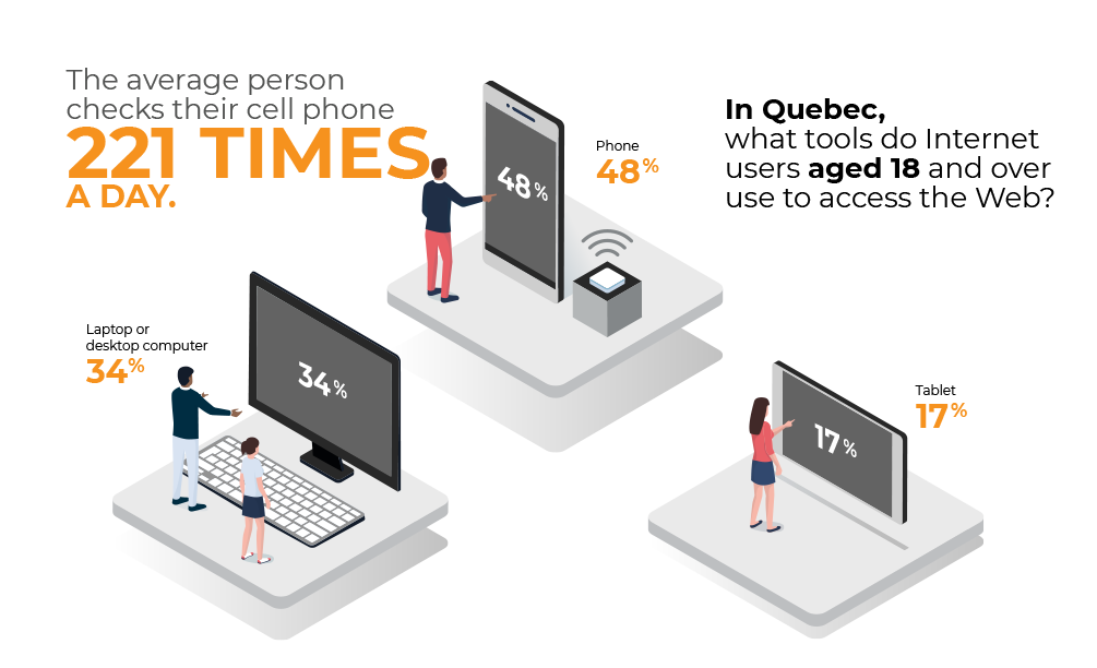
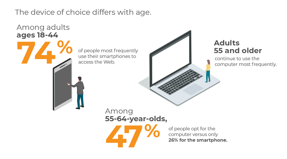
We can easily recognize that the smartphone is the medium not to be neglected when creating your website!
Create a better user experience
These users who navigate the Web from their mobile devices expect a browsing experience just as good as what they would have when browsing from a computer. Easily accessible pages and sections, clickable buttons, appropriately sized images and readable text are just a few examples of content that contribute immensely to the user experience, whether positive or negative.
Considering that a user’s attention span is about 7 seconds before they get bored and try a new option, it’s essential to offer user-friendly content in order to convert these visitors into customers. This way, you avoid disappointing potential customers who end up leaving your website and turning to your competitors.
These potential customers and Internet users want only one thing: to find accurate information quickly and easily. In a flash, they want to buy products, fill out forms, search for an address or schedules, directly on their cell phone.
Websites that are not compatible with mobile devices force users to pinch their screen or zoom in to read the content. This is a frustrating experience that will result in a dangerously high rate of mobile users leaving the site without having had a chance to consult it properly.
These users often use different media to visit the same site and therefore appreciate to find a style and content that are the same from one device to another. The responsive design is the ideal tool for this.
Meeting Google’s requirements
One very important thing to know: Google regularly updates its search engine algorithms to provide users with the best possible experience and the most relevant and interesting search results.
As of July 1, 2019, Google primarily uses the mobile version of all new websites (new websites = those created as of that date and for those not previously listed in Google search) for indexing and ranking in its search engine. This change is mainly due to the fact that the vast majority of web users access Google searches from a mobile device. In fact, site owners can check Search Console to see when their site was switched to mobile-oriented indexing.
All this to say that if your site is not adapted to mobile devices, you risk falling very low in your SEO results and especially displeasing mobile users (AKA potential customers!!).
By offering an adaptive website, your natural referencing on Google will be optimized and you will have a better visibility. Your return on investment will be improved. Do we need to say more?
——————————–
Put your business under Google’s spotlight with a responsive website design. Beware! It doesn’t happen in the blink of an eye! You need pros.
Good thing is, at Power Go, we know the Web like the back of our hand and we have plenty of ideas, each one better than the next! Our experts will guide you step by step in the conception and creation of your project. Contact us for personalized advice.